

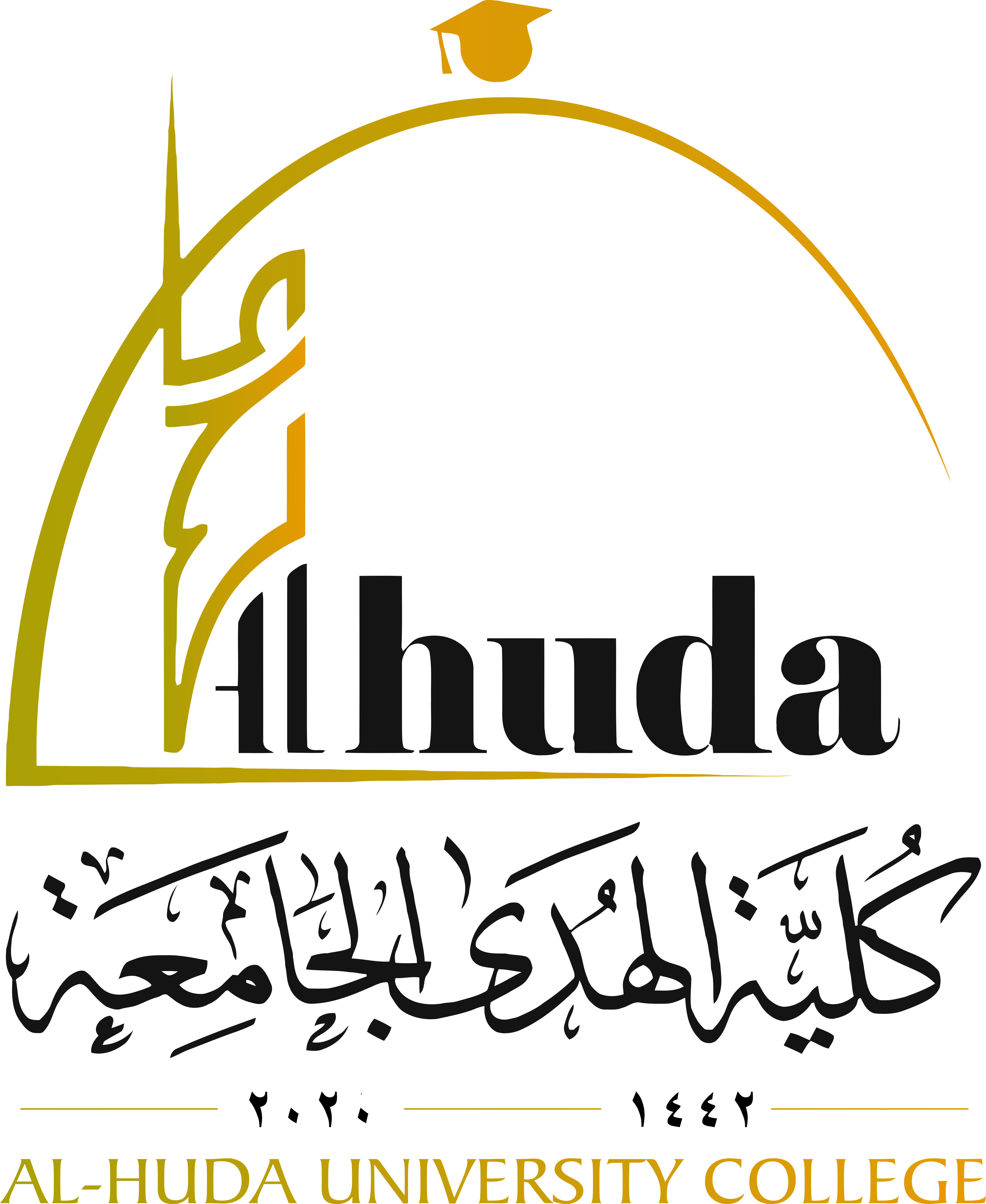
Logo symbolism
We were keen for the logo of Al-Huda University College to carry clear meanings and simple components inspired by the cultural identity of the environment, and to be contemporary, combining a modern form with authentic meanings, as follows:
1. The word “Al‑Huda” is written vertically and rises upward, as guidance should be a beacon to follow, calling for goodness, knowledge, and success.
2. The fully vocalized word “Al‑Huda” is used to symbolize the minaret of Heet (Al‑Farooq Mosque), regarded as the oldest Islamic civilizational landmark in Mesopotamia, built in the year 16 AH.
3. The dome was used to express our Islamic cultural identity and to reflect the architectural language of the university itself, which adopts the dome as a key design element, thereby creating harmony and specificity between the logo and the institution it represents.
4. The dome is not a closed, traditional dome; rather, it is left open and rests on a solid base, with the word “Al‑Huda” forming the supporting column. It remains open to the outside world where it meets the English word “Alhuda,” indicating that the university interacts with its surroundings and is in constant development, not closed in on itself. Here, the word “Al‑Huda” emerges from the dome and extends toward the vast expanse of the higher horizon.
5. The global dimension is emphasized by what has been mentioned above and by blending the Arabic letter “أ” and the English letter “A” in composing the words “Alhuda / Alhuda.” This aesthetic fusion along the x‑ and y‑axes of a graph symbolizes the perpendicular relationship between the time‑progress axis (x) and the knowledge‑production axis (y).
6. The students’ cap is placed above the dome, inspired by what Qur’an memorizers used to wear in the institutes of learning in Al‑Andalus, where the person who completed the Qur’an would place the Mus’haf on his head. Europe later adopted this tradition, and it was incorporated into the design to indicate that the logo belongs to an educational institution instead of using the crescent that people are accustomed to seeing atop domes.
7. The college name is written in Arabic before English at the base of the logo to signify that the Qur’anic script has precedence over others.
8. Simplicity and modern significance were taken into account in the logo, and the colors were carefully selected. The logo was also designed so that it can be implemented on all university products and on items such as official documents, gifts, and printed or engraved materials.